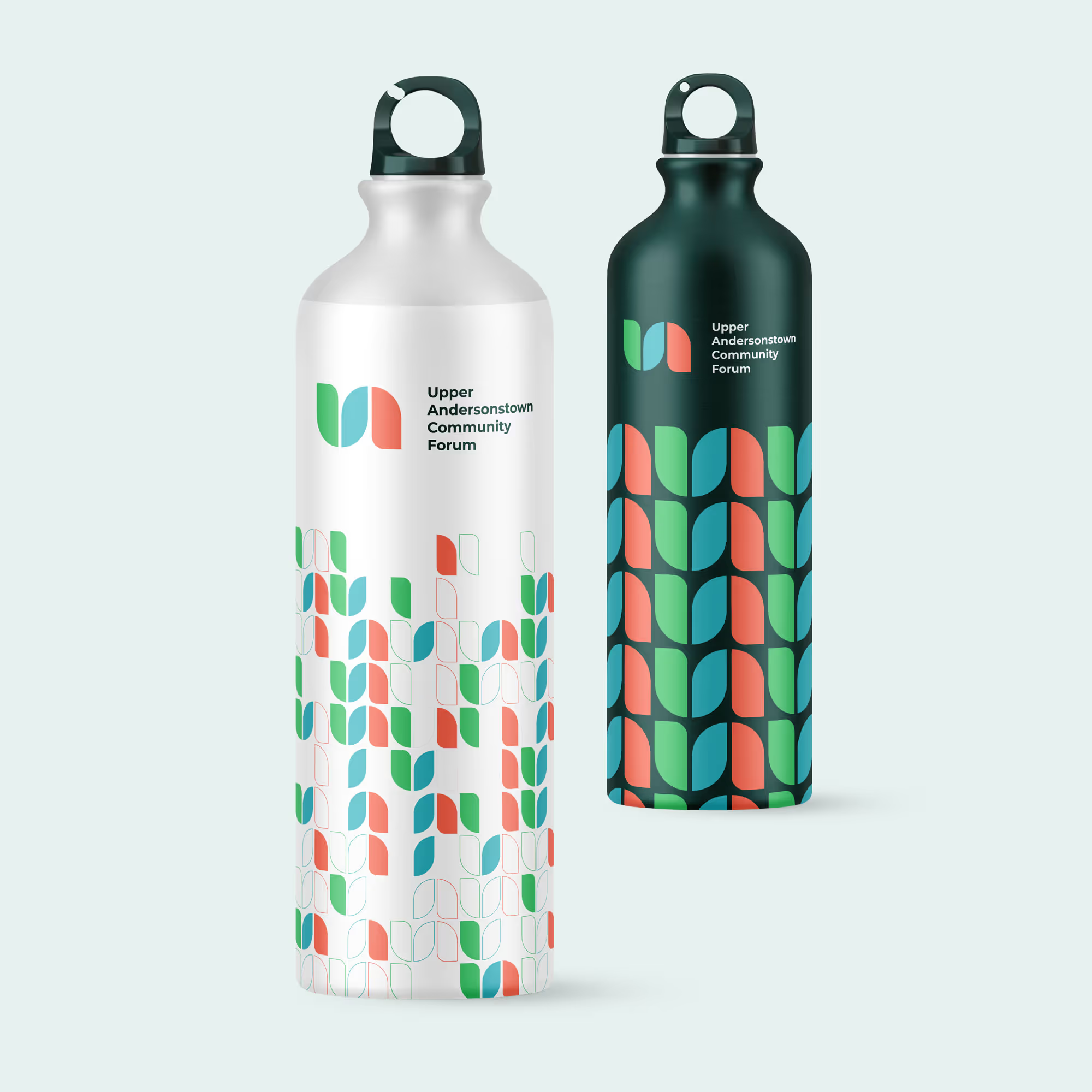
For over 25 years, the Upper Andersonstown Community Forum has been a driving force for positive change in the local area. They came to us seeking a new brand identity that would reflect their vibrant spirit, their commitment to accessibility and inclusivity, and their strong connection to the community they serve.
Edward recognised the importance of encapsulating the vitality and dynamism of the local community in the new brand identity. Our shared objective was to craft a brand that not only grabs attention but also communicates a feeling of hope and potential.
To achieve this, Edward created a striking and inviting brand identity. The main colour scheme comprises a blend of green shades complemented by vibrant coral and iris blue accents. These colours were selected to mirror the region's natural charm and the liveliness of its residents.
Brand Guidelines
Brand Launch
Website Design
Website Development
Motion Graphics


We turned to Edward not only for his expertise but also because he has deep roots within the local community. Edward seamlessly captured our vibrant spirit, commitment to accessibility and inclusivity, and our deep connection to the community we serve. The result was beyond our expectations."
— Rory Flanagan, Head of Marketing, UACF
